Alice Street - Year 3 - Showreel
Tuesday, 20 May 2014
the finished film ...
This is the first pass of the finished film. the only changes that will be made is the sound as at the moment it is slightly out of sync:
Thursday, 8 May 2014
Conclusion...
Over the course of this year I have experience a very big learning curve. I have had to learn to not only be able to adapt my skills to fit to a very different style to that of my own, I have also had to learn how to integrate myself effectively into a group work environment and being understanding and sympathetic to the others in my group as well as to what they contributed to the film.
Overall, I am really please with the progress that I have made over this year and the new skills that I have acquired such as having to learn new and more effective ways in which to model and learning how to use completely new elements to Maya such as using Ndynamics and fluid dynamics. I have also been able to improve my Digital painting and texturing skills so that now I am able to create much more detailed and effective, eye-catching textures and other digital pieces.
Overall, I am really please with the progress that I have made over this year and the new skills that I have acquired such as having to learn new and more effective ways in which to model and learning how to use completely new elements to Maya such as using Ndynamics and fluid dynamics. I have also been able to improve my Digital painting and texturing skills so that now I am able to create much more detailed and effective, eye-catching textures and other digital pieces.
Texturing for buildings and props:
Now that I have finished creating all of the models that are required for the film, my next task was to create some of the textures that would go on some of the models that I have created. I tried to give all of the textures an aged, worn look, but with the same simplistic, sharp look that is in the design of the models.
textures for city buildings:
Texture for bank exterior:
More City Building Textures:
Table and Table leg Textures:
Addition to bank vault set - small floor lamp and hole added in floor:
A small addition that I was asked to create was a small floor light that would be placed within the bank vault room set to help to create some more dynamic lighting within the set. Although this is a very simple design it effectively fits the function to which it has been created and will contribute to help add some more detail to the overall set.
I have also added a hole in the floor that is required for the scene where one of the character's accidentally cuts a hole in the floor with a chainsaw, which he then falls through afterwards. To create this I used the boolens settings to create a simple cylindrical hole which I then had to extrude downwards so that it created the illusion of some depth.
This is how the finished product looks:
Explosion scene - using fluid dynamics and gravity settings:
One of the most dynamic scenes within the film is when one of the walls into the back is blown open so that the two characters can enter the room.
To create this effect I used some of the Ndynamics features:
This clip shows all of the various attempts at creating a realistic explosion, as well as using different sized sections of rubble and the speed at which the pieces fell. the last explosion is the final animation that will be used in the film.
To create this effect I used some of the Ndynamics features:
- I created a polygon and then, using the cut faces tool, I created lots of jagged faces all over the polygon. I then detached the faces so that they were all separate pieces.
- I then made the polygons an Ncloth.
- Then created a sphere and keyed it so that it moves through the wall.
- selected both the sphere, wall and the rest of the set and made them all passive colliders. this then made a shatter effect.
This clip shows all of the various attempts at creating a realistic explosion, as well as using different sized sections of rubble and the speed at which the pieces fell. the last explosion is the final animation that will be used in the film.
Overall, I am really pleased with the end result all it the explosion is realistic and dynamic, and will really hep to lift the action of the rest of the film.
Thursday, 6 March 2014
A few small editions to the bank vault set...
To fill out the space in the bank vault set, I have designed a small desk, paper and pen and a lamp. these have just helped to make the scene more realistic, but also so that the scene doesn't feel so empty. I really like designs as I think that they will be a small flourish to the rest of the scene that will help to add to the dimensionality and atmosphere of the scene.
Wednesday, 5 March 2014
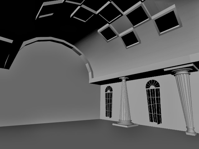
Bank vault room - final changes...
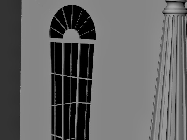
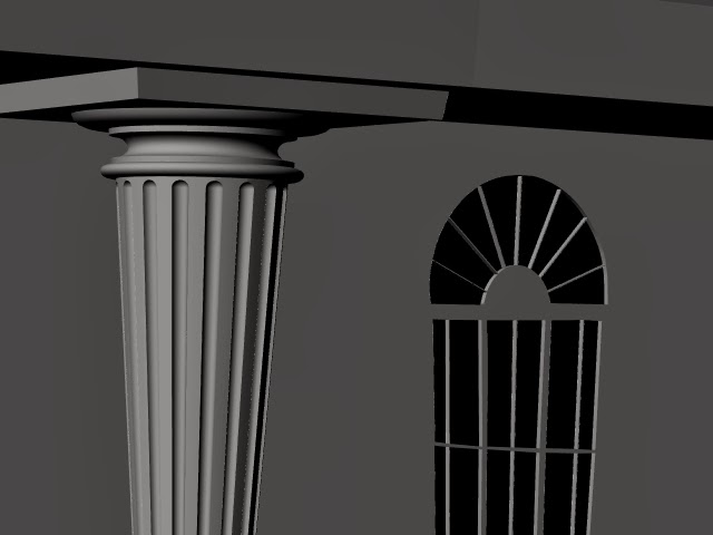
although we are now happy with the actual dimensions of the room and that it will now be a much more effective space for the main action of the film to happen in, it now feels as though the pillars aren't quite fitting in with the rest of the scene, so we have now decided on this design for the pillars.
I have also incorporated in some new windows which fit slightly more to the original design and sections of the roof and ceiling windows have been neatened up slightly to give the whole look of the film a much more clean cut look which now all works much better together. I have also added some very simple but effective chandeliers to the ceiling just as a finishing touch to make the scene have a bit more detail an dimensionality to the set.
I have also incorporated in some new windows which fit slightly more to the original design and sections of the roof and ceiling windows have been neatened up slightly to give the whole look of the film a much more clean cut look which now all works much better together. I have also added some very simple but effective chandeliers to the ceiling just as a finishing touch to make the scene have a bit more detail an dimensionality to the set.
Subscribe to:
Comments (Atom)


